Your Lighthouse Score Is Green. Why Does Your Website Still Feel Slow?
A good Lighthouse score does not always mean a fast-feeling website. Here is how perceived performance, Core Web Vitals, interactions, and real-user testing reveal what automated audits miss.
The Core Principle
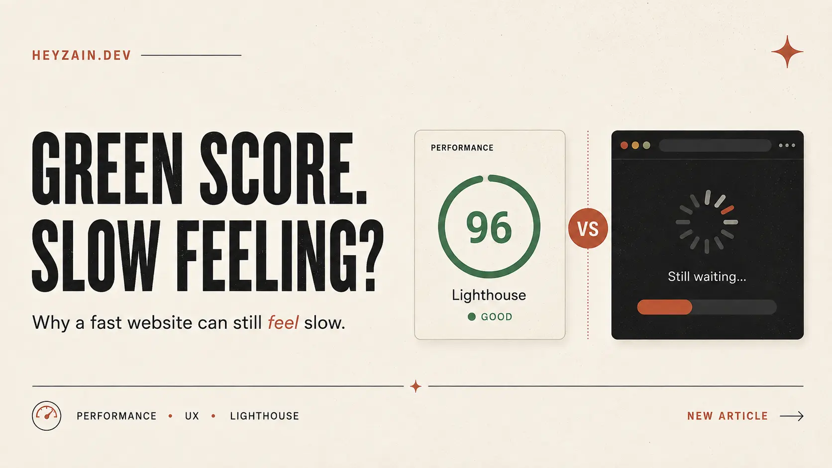
A website can measure as fast without feeling fast. Lighthouse is an essential diagnostic tool, but treating a lab score as the final definition of user experience blinds you to post-load delays, unresponsive interactions, and unoptimized content sequences.
You run your website through Lighthouse.
Performance is green.
Largest Contentful Paint looks good. Layout shift is under control. There are no obvious warnings that make you panic.
Then you open the website yourself.
And somehow, it still feels slow.
- Maybe the introduction takes too long.
- Maybe the page is visible but you cannot interact with it yet.
- Maybe clicking a link gives you a brief moment where nothing seems to happen.
- Or perhaps the interface technically loads quickly, but the useful part of the page arrives later.
That creates an important distinction: A website can measure as fast without feeling fast.
Lighthouse is extremely useful. I use it too. The mistake is not using Lighthouse. The mistake is treating its score as the final definition of performance.
A Lighthouse Score Is a Signal, Not the Entire User Experience
Lighthouse is an automated tool for auditing web pages, including performance, accessibility, SEO, and other quality checks. Its Performance score combines several measured metrics into a weighted score. Scores from 90 to 100 are displayed as green and considered good.
That makes the score useful for quickly identifying whether something is obviously wrong.
But consider what a real user actually does. They do not:
- Open your website.
- Read your Lighthouse score.
- Decide the website is fast.
The Real User Sequence
Every delay inside that sequence affects how fast the product feels. And some of those delays are not well represented by a single performance score.
PageSpeed Insights Already Shows Why One Number Is Not Enough
One of the most useful things to understand about PageSpeed Insights is that it separates lab data from field data.
Generated in a synthetic, controlled environment with fixed throttling. Ideal for reproducible debugging, benchmarking, and identifying regression during development.
Sourced from real Chrome users across diverse mobile hardware, varying 4G/5G/WiFi networks, multi-page flows, and complex interaction patterns.
A lab test gives you something repeatable. A user gives you reality.
A real visitor might be:
- using an older phone with limited CPU cycles,
- connected through a weaker mobile network with packet loss,
- returning with cached assets and service workers,
- navigating between routes on a Single Page Application,
- clicking buttons while JavaScript is busy parsing or hydrating,
- opening your application after it has been running for several minutes,
- or following a flow your initial page-load test never exercised.
Neither view makes the other useless. They answer different questions. You need both perspectives when performance matters.
Users Experience a Sequence, Not a Performance Score
When I think about frontend performance now, I find it more useful to break the experience into moments.
1When does the user see something?
A blank screen immediately feels slower than a screen that responds with useful visual feedback. This is where metrics such as First Contentful Paint (FCP) can help. But seeing something is only the beginning.
2When does the user understand the page?
Suppose your header appears instantly, but the hero containing the actual value proposition arrives much later. Technically, content has rendered. From the user's perspective, however, the page still has not answered the most basic question: What is this website, and what can I do here? That is why content priority matters almost as much as raw speed.
3When can the user interact?
A button that is visible but temporarily unresponsive creates a particularly frustrating delay. The interface looks ready. The user behaves as though it is ready. But the browser thread is busy. A fast-looking interface that ignores input feels worse than one that clearly communicates it is still preparing.
4Does the interface remain stable?
Unexpected movement affects the perception of quality. A button moving just as someone tries to click it does not only create a layout problem—it creates uncertainty. The page stops feeling controlled.
Core Web Vitals Help Measure Important Parts of This Experience
Google's current Core Web Vitals focus on three major parts of the user experience:
These are valuable metrics. They move performance measurement much closer to what users actually experience. But there is another critical observation:
Your product may contain important moments that no standard metric completely describes.
Dashboard: When can the user see their actual data?
Ecommerce: When can the user confidently add the item to their cart?
Search: When do useful results become visible?
Portfolio: When is the hero actually readable and usable?
Those are product questions, not only browser questions. And sometimes you need to measure them yourself.
The Slow Feeling Often Starts After the Initial Page Load
This is where a website with good performance numbers can still disappoint. The HTML arrives quickly, the primary content paints, Lighthouse finishes its test, and everything looks green.
Then the visitor clicks navigation or toggles a filter. That journey looks like:
The waiting happened after the initial page load. This is especially prevalent in modern React and Next.js applications where most interactions bypass full-page reloads.
1. Blocking splash animations
Animations can make a product memorable, but they can also become artificial loading screens. If your app is ready but makes users wait 3 seconds for an intro, you've added 3 seconds to the experience yourself. Does this animation earn the time it asks from the user?
2. Blank route transitions
Clicking navigation and seeing nothing happen creates uncertainty. Even a 200ms delay feels agonizingly long when the interface provides zero visual acknowledgement.
3. Client-side data fetching waterfalls
The application shell arrives quickly, but the information the user came for sits behind nested useEffect hooks. The page appears loaded long before it becomes useful.
4. Heavy JavaScript after loading
Expensive scripts can tie up the main thread post-hydration, delaying click responses and making scrolling stutter.
5. Content appearing in the wrong order
If decorative graphics and complex widgets render before the primary headline and action buttons, the user feels stuck. Performance is an engineering problem—and a prioritization problem.
The Framework I Use: Measure Four Moments, Not One Score
Instead of asking only “How fast is this page?”, I evaluate four product moments:
Visible
How quickly does the first useful visual response appear? Prioritize initial feedback so the user knows the application has acknowledged their request.
Meaningful
When can the user understand the page? The headline, core content, and primary context must arrive without waiting on secondary widgets.
Responsive
When the user interacts, does it respond immediately? Never present an interactive-looking element that silently swallows or delays clicks.
Stable
Does the interface stay predictable while loading? Reserve layouts, avoid unexpected shifts, and provide honest progress indicators.
It is not a replacement for Core Web Vitals—it is a product-level layer on top of them.
I’m Testing This on heyzain.dev
My own portfolio, heyzain.dev, is a prime example because it features an animated entrance. I like the animation. The critical question is whether liking the effect is enough justification for the time it takes.
Current Version
- Current entrance animation sequence
- Timed hero reveal
- Sequential interaction timing
Test Version
- Shorter, streamlined entrance
- Non-blocking animation layers
- Immediate interaction availability
The key discipline is changing one meaningful variable at a time so that any improvement is directly attributable.
Measure When the Product Becomes Useful
For heyzain.dev, I define a custom state: Hero usable (headline readable, CTA active, navigation live). Here is how I instrument it with the User Timing API:
performance.mark("hero-usable");

performance.measure("time-to-hero-usable", {
  start: 0,
  end: "hero-usable",
});

const measurement = performance.getEntriesByName(
  "time-to-hero-usable"
)[0];

console.log(
  `Hero usable after ${measurement.duration}ms`
);
This is a product-specific measurement. It answers what standardized browser metrics were never designed to answer: When does my specific interface become usable?
Test the Experience, Not Just the Page
A practical audit should go beyond clicking “Analyze”. Here is the workflow I follow:
Run PageSpeed Insights
Test mobile and desktop. Don't obsess over a perfect 100—focus on obvious bottlenecks in the 90+ range.
Separate Lab Results from Field Results
Compare CrUX data with local audits to identify disparities caused by real hardware and networks.
Record the Page Visually
Use Chrome DevTools filmstrips to confirm when meaningful content actually becomes visible.
Interact with the Application
Click navigation, toggle filters, and submit forms. Measure latency across the whole journey.
Define Your Key Product Moment
Identify when the user can accomplish their core task (e.g. cart ready, data loaded, hero readable).
Change One Thing at a Time
Shorten an animation, eliminate a dependency, or pre-render critical data—then re-measure.
Performance Is Also a Product Decision
Performance is frequently treated as though it belongs purely to backend queries and bundle sizes. Those matter. But many sluggish moments stem from product design choices:
- Should the animation block interaction?
- Should this data load before the rest?
- Should navigation wait for the request to resolve?
- Should the interface acknowledge clicks immediately with optimistic UI?
- Should returning visitors see the same splash introduction again?
These are architectural decisions. That is why an audit must not stop when Lighthouse turns green.
The Takeaway
“Fast is a user never wondering whether the product is ready.”
Audit the waiting—not only the loading.
Frequently Asked Questions
Why does my website feel slow even with a good Lighthouse score?
A Lighthouse test measures performance under controlled synthetic conditions. Your real user experience can also be affected by route transitions, client-side data fetching, animations, background JavaScript execution, and device bottlenecks.
Is a 100 Lighthouse score necessary?
No. Lighthouse considers scores between 90 and 100 good. Google explicitly notes that achieving a perfect 100 is difficult and not expected for every website. Focus on real user feel and perceived speed.
What are the current Core Web Vitals?
The Core Web Vitals are Largest Contentful Paint (LCP) for loading, Interaction to Next Paint (INP) for responsiveness, and Cumulative Layout Shift (CLS) for visual stability.
What is perceived website performance?
Perceived performance describes how fast an application feels to the person using it. It is influenced by when useful content appears, immediate interactive feedback, predictable layouts, and transparent progress indicators.
Is PageSpeed Insights the same as Lighthouse?
Not exactly. PageSpeed Insights runs Lighthouse for its lab diagnostics, but it also displays real-world field data from the Chrome User Experience Report (CrUX) when traffic thresholds are met.
Should I remove animations to improve website performance?
Not automatically. Animation enhances hierarchy and brand polish. The key question is whether it delays critical content or blocks user interaction. Always measure before removing.
HeyZain is the engineering portfolio and technical publication of Zain Ali, a full-stack developer and software engineer specializing in Next.js, React, Node.js, TypeScript, and MongoDB. He builds production-ready web platforms, SaaS products, marketplaces, and developer tools from schema design to edge deployment.